
Why not a new look at age 10? Check out our new brand :-)
Since the beginning of 2023, Kelvin and I have met with Matthew Manning of Gumbo Media. Last year, I reconnected with Matthew, who knew our work and wanted to help. First, Matthew asked Kelvin and me questions about Uniting Distant Stars. Next, he started to create our new logo and brand kit.
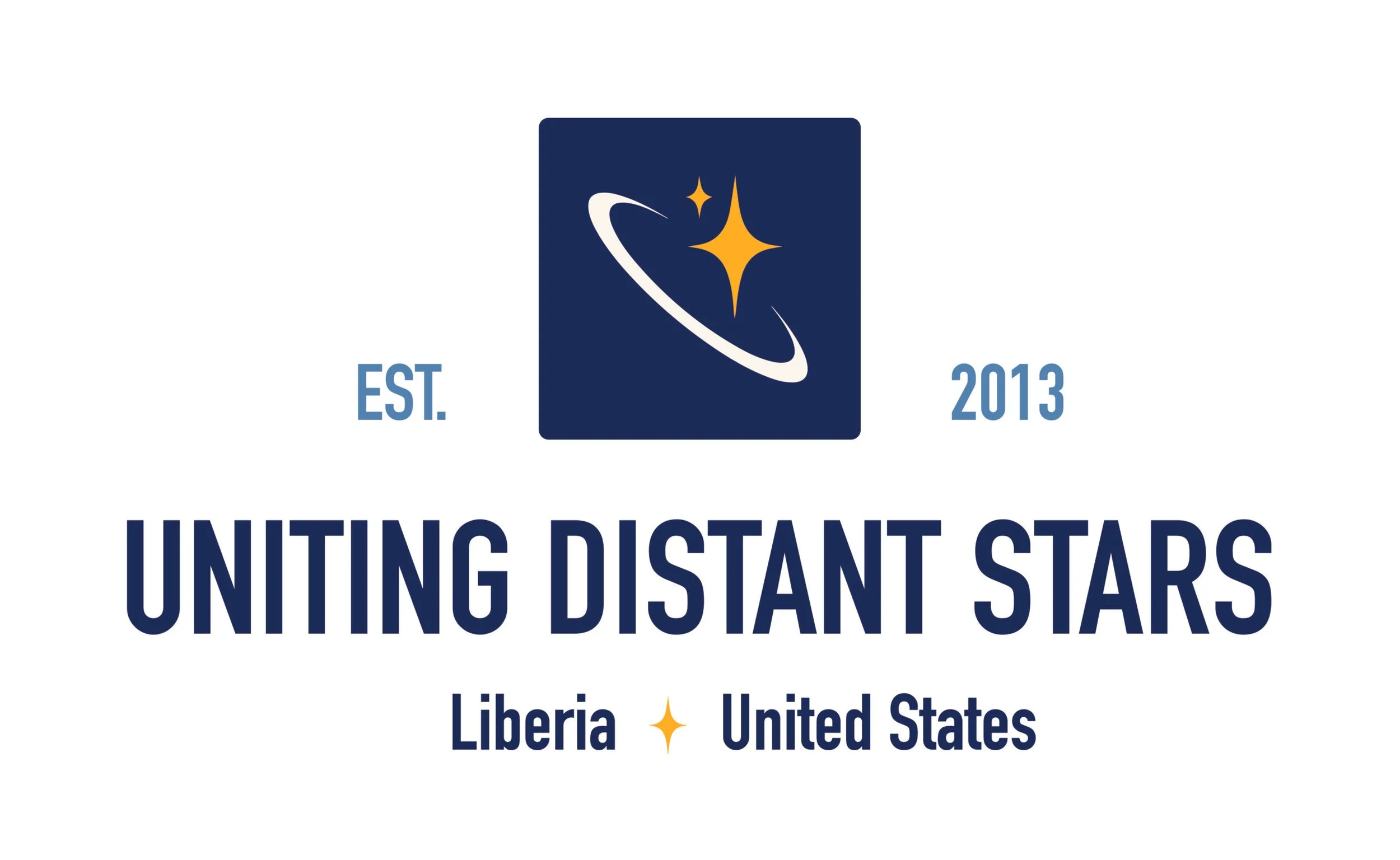
As part of celebrating our 10th anniversary, it was time for a new look. The new logo is simple and versatile. The new design kept certain elements like our colors--blue and gold, stars, and a circle. From the start, the circle meant “uniting,” but Matthew saw it as a hug. We liked that. Also, he explained the meaning behind each color:
- Gold represents community, vitality, prosperity, and joy.
- Blue represents trust, loyalty, dependability, and sustainability.
Below are a few examples. The first logo is for banners and backs of t-shirts. The second logo is for business cards and letterhead. The third logo is for ball caps. The fourth and five logos are icons. The sixth one is a cut-out icon. Each logo has more than one option from our six-color palette of three shades of blue, gold, black, and cream.


![]()
![]()
![]()